
ASMBL
How branding helps ASMBL define a new strategic direction.
As ASMBL provides tech solutions for retail clients it also undergoes a transformation of its own brand.
Overview
ASMBL (formerly known as Assemble – but we'll get to that) was born more than a decade ago in tech-centric Seattle. First and foremost a software engineering firm, Assemble (now ASMBL) quickly hit its stride as a full-service digital consultancy. It continues to develop tech solutions for some of the biggest, brightest companies in the world, delivering industry-leading apps, IoT solutions, and software for businesses across a wide swath of industries. Today, it remains fully committed to staying engineering-forward, while being driven to integrate technology more completely into online retail efforts. The goal is straightforward: Help retail brands embrace technology to first-class passenger status. The idea of pushing deeper into the online landscape had simmered for years, with the full width and breadth of services taking shape in 2022. As 2023 dawned, there was a need to bolster the company’s outward image to better reflect this strategic, retail-forward direction.
WHAT WAS NEEDED
When Keith Karlick started as Vice President of Experience and Design at Assemble early in 2023, much of the foundational work needed to expand the company's scope of services had been laid down by co-founder Jeremy Norberg and Loretta Soffe, Vice President of Global Retail. The pair had developed a well-defined road map for fully integrating technology into online retail, but they wanted the company’s brand to reflect a fluency and understanding of that market.
The team had clearly earned its chops in tech but needed to make two distinctions for potential retail-forward clients. First, it had to show a deep understanding of the business of retail. Second, it had to showcase its ability to design and build exceptional customer experiences at scale.
Karlick knew the company's numerous past successes had primarily blossomed from referrals, manifesting themselves with minimal attention paid to brand building and marketing. With the company poised to diversify and aiming to appeal to clients selling more than technology, it was time to leverage design to develop a personality and brand voice that reflected the skills and expertise of the company.
“We needed,” said Karlick, “to create a brand logo and language that brought home the points that we have a really impressive portfolio of outstanding work, a team full of smart and creative people, and proficiency in online retail.”
THE APPROACH
A lot of brand-building work is finding the internal truths that make a company successful. Unearthing these truths and distilling them into a language easily digested are foundational components of any brand that matters.
"We had already completed the positioning and messaging work internally," Karlick said. "We needed to build on that with creative work that allowed us to fine-tune our identity."
Enter Okaybro, a Seattle-based branding agency with a portfolio of work that includes Amazon and Specialized Bikes. Defined brand parameters were in place when Okaybro came on board. They included:
·It's a digital consultancy, with expertise in strategy, design, data, and engineering
·There's a heritage of high-level technical expertise.
·It understands the business of retail.
·Solutions can be scaled to clients of different sizes.
·It offers a fresh perspective different from other tech firms.
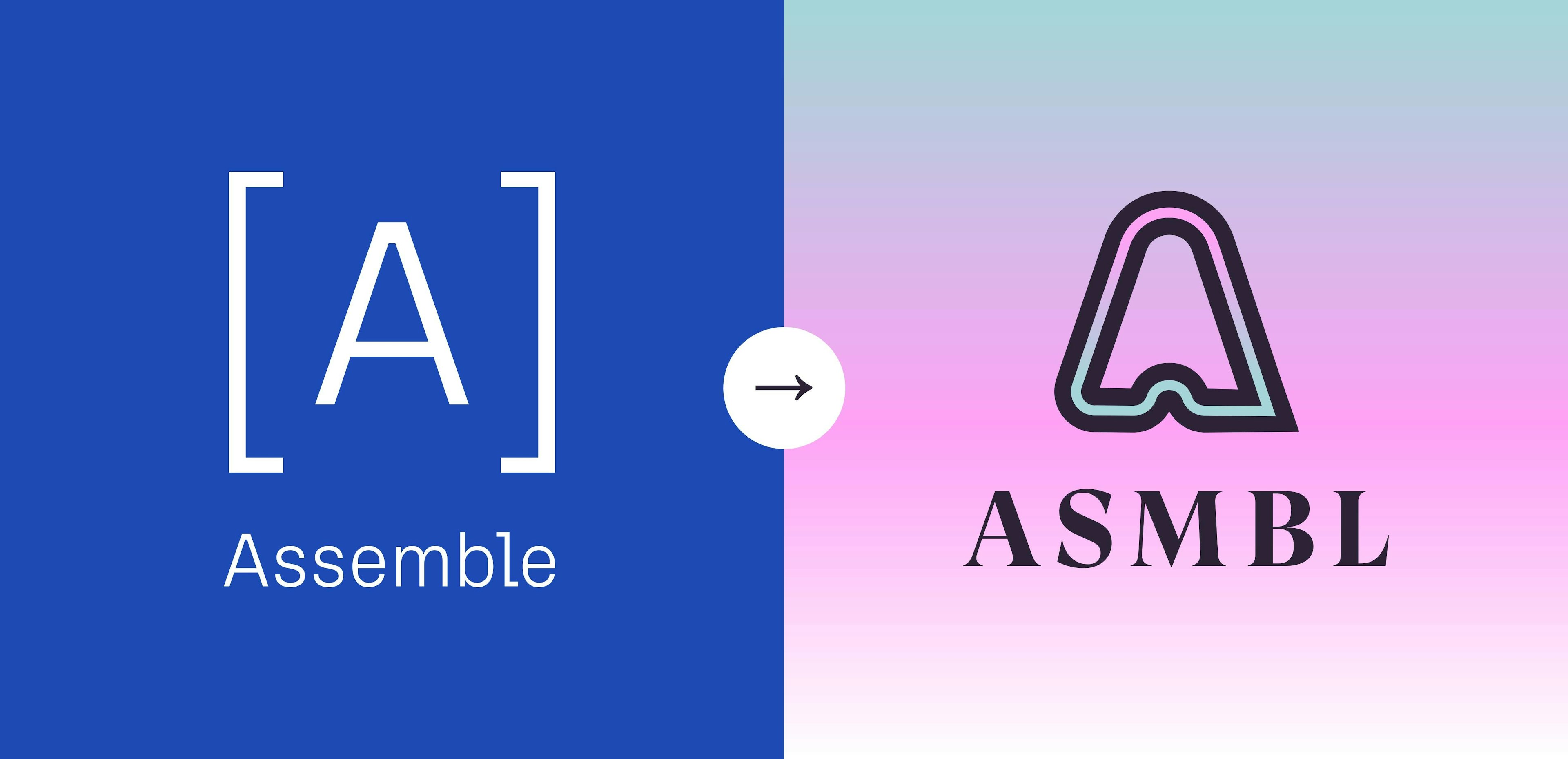
Dave Taylor, principal of Okaybro, began the project by designing a new logo. Logos make a brand – conveying a company's values and sense of purpose and serving as an initial touchstone with the rest of the world. Taylor had a hurdle to clear first. He had to avoid making it look like ass. Literally.
To be clear, we're talking about the company's name – Assemble.
"Everybody knew we had to change the layout, the lettering, the typeface," Taylor said.
Taylor heard from several employees that when looking at a logo that features the word 'Assemble' it was hard to not focus on the first three letters.
“That's something we couldn't unsee,” Taylor said.
The new branding material needed to show the company as approachable and reflect the consummate professionals that make up the team. It also had to look different. The logos and branding of numerous tech firms feel oddly similar, and the assets Taylor delivered provided a more distinct feel – one that folds in the innovative elements of retail, tech, professionalism, and creativity.
Taylor offered up several versions of a new logo, giving careful consideration to colors, shape, and typography to reflect both the company's technical roots and the broadening focus.
"We went through a few rounds and iterations," Taylor said. "They are a thoughtful group, a team of smart people who have the freedom to share their opinions. Every single piece of feedback they provided was thoughtful and actionable. It was such a valuable perspective."
And that’s how ASMBL was born.
SOLUTION
Now officially ASBML, the company's new logo is a uniquely shaped "A" unlike anything else in the tech world. The colors are familiar to fashion and retail brands. It has a sophisticated, engineered vibe that reflects creativity and professionalism.
"It's different," said Taylor. "That was the point. It reflects a brand that wants to stick out."
The brand voice is also being shaped – a non-pretentious tone that's confident but not cocky, smart but not nerdy, familiar but not redundant. Both the brand voice and the new logo will be unveiled in the coming weeks on a new website, sales literature, correspondence, and – yes – schwag.
"We're just starting to live with it, and I'm stoked," Karlick said. "It looks good. It sounds good. We found a voice that feels authentic to the agency and those who work here. We're really happy where we landed and excited about where we will take it."